Black
Type
Visual Identity
Role
Art Director / Brand Designer
Engagement
Freelance Project
Year
2022
Collaborators
Agostina Morero (Brand & Visual)
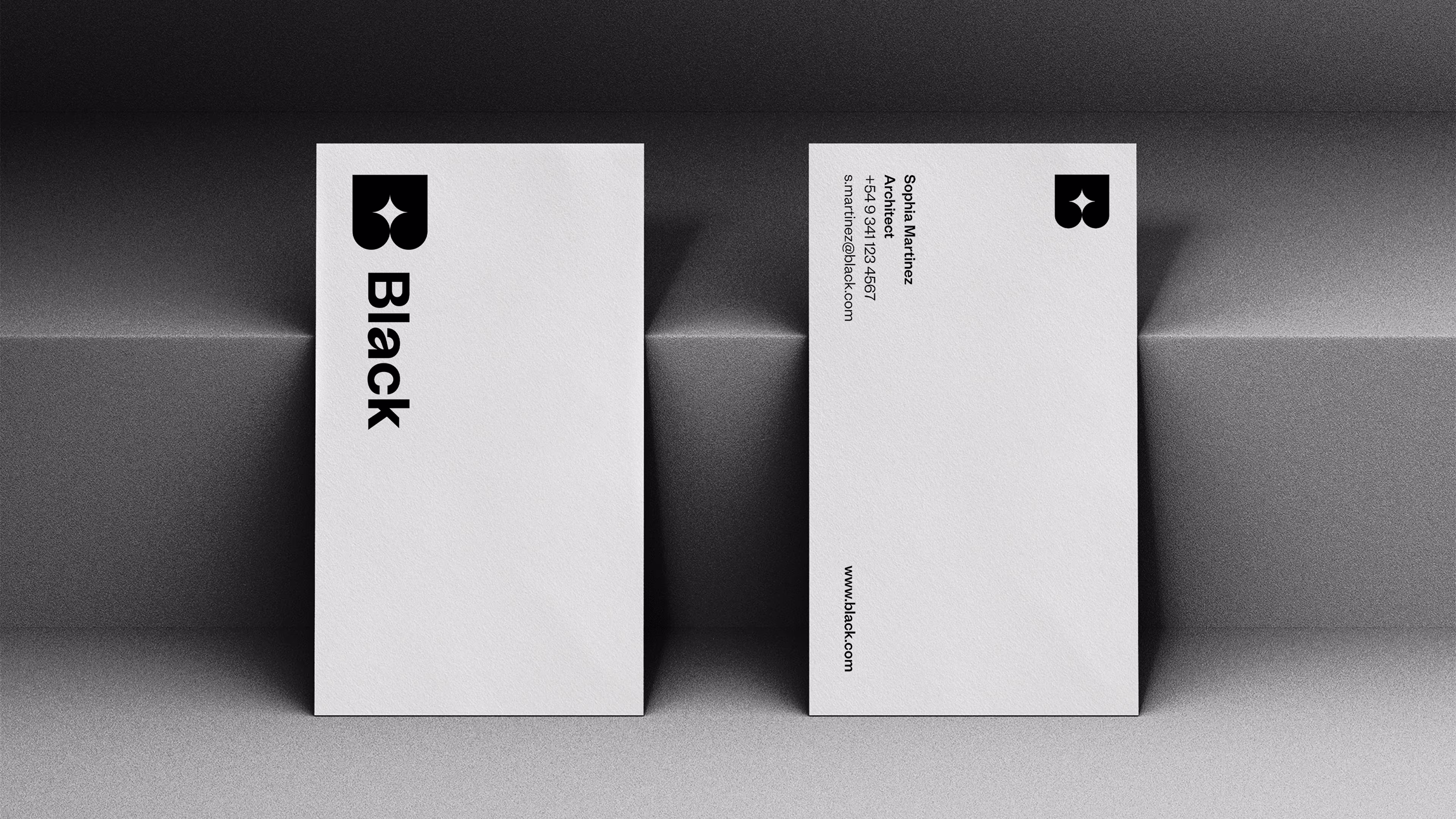
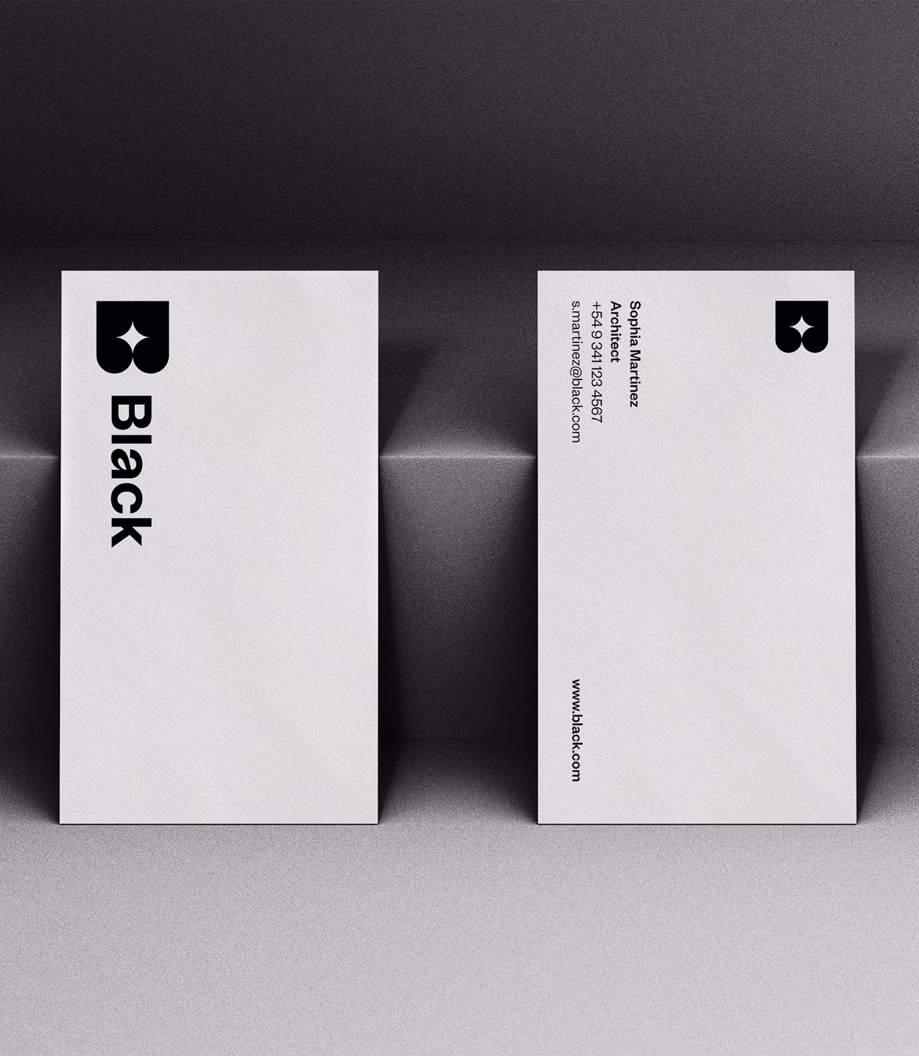
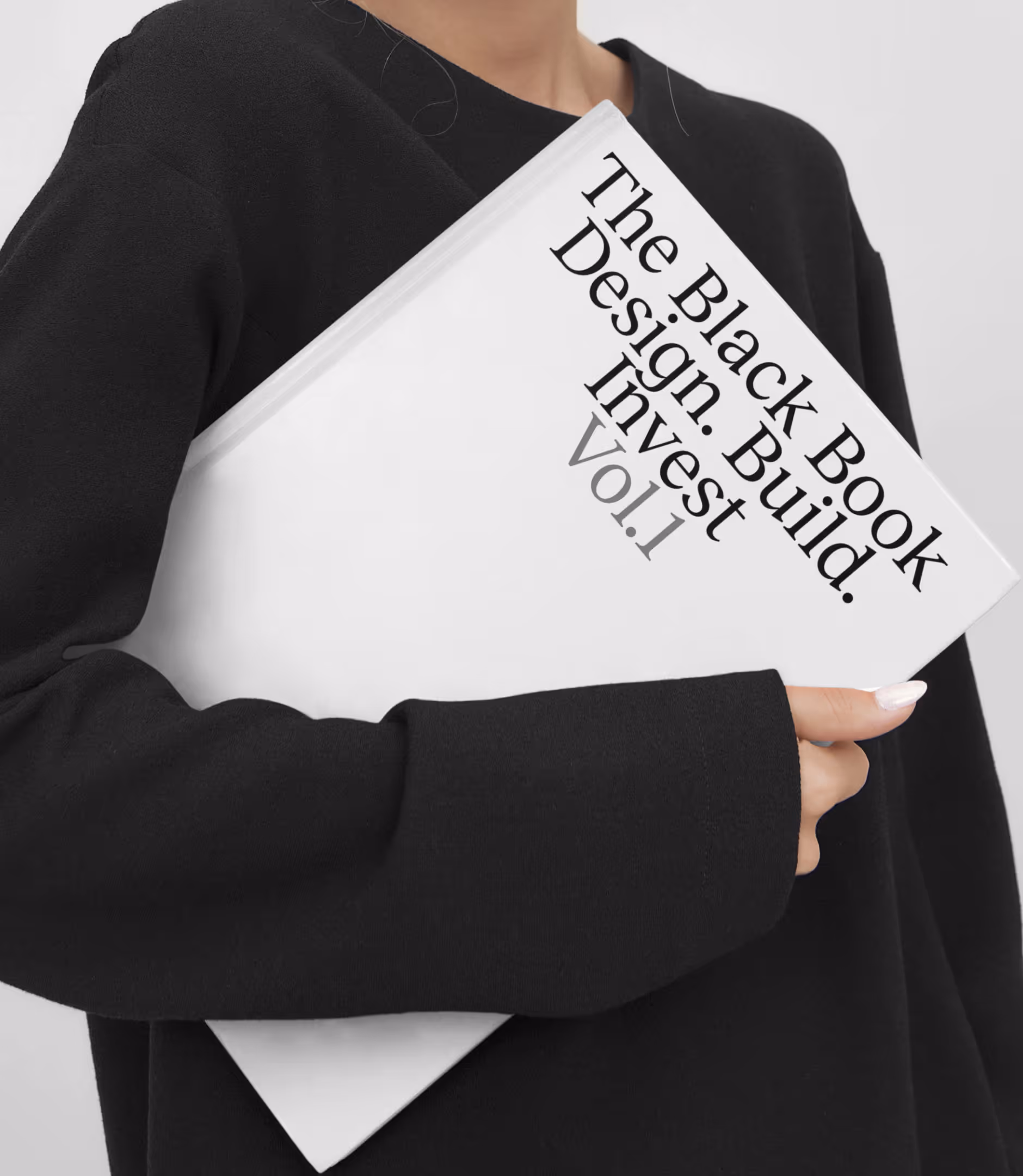
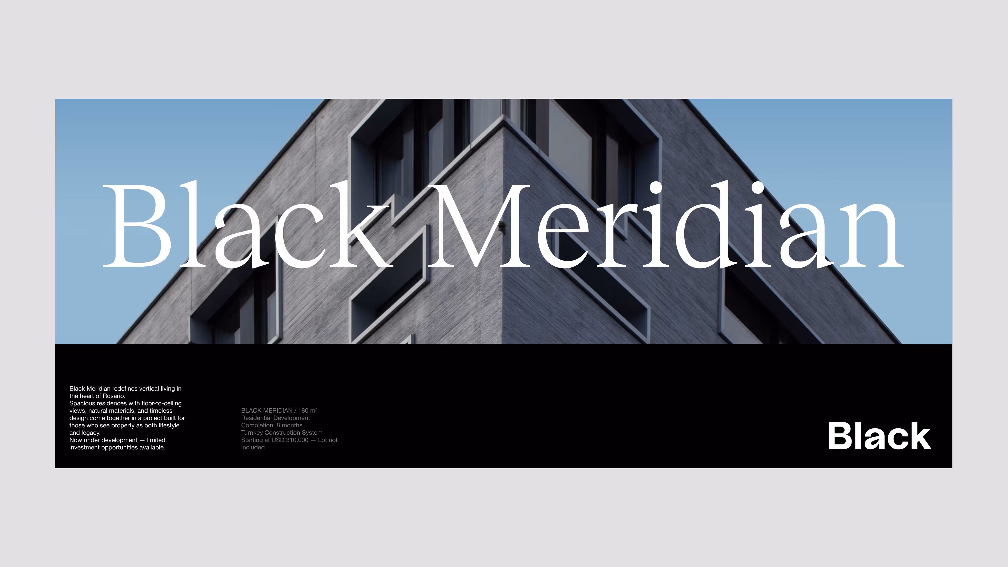
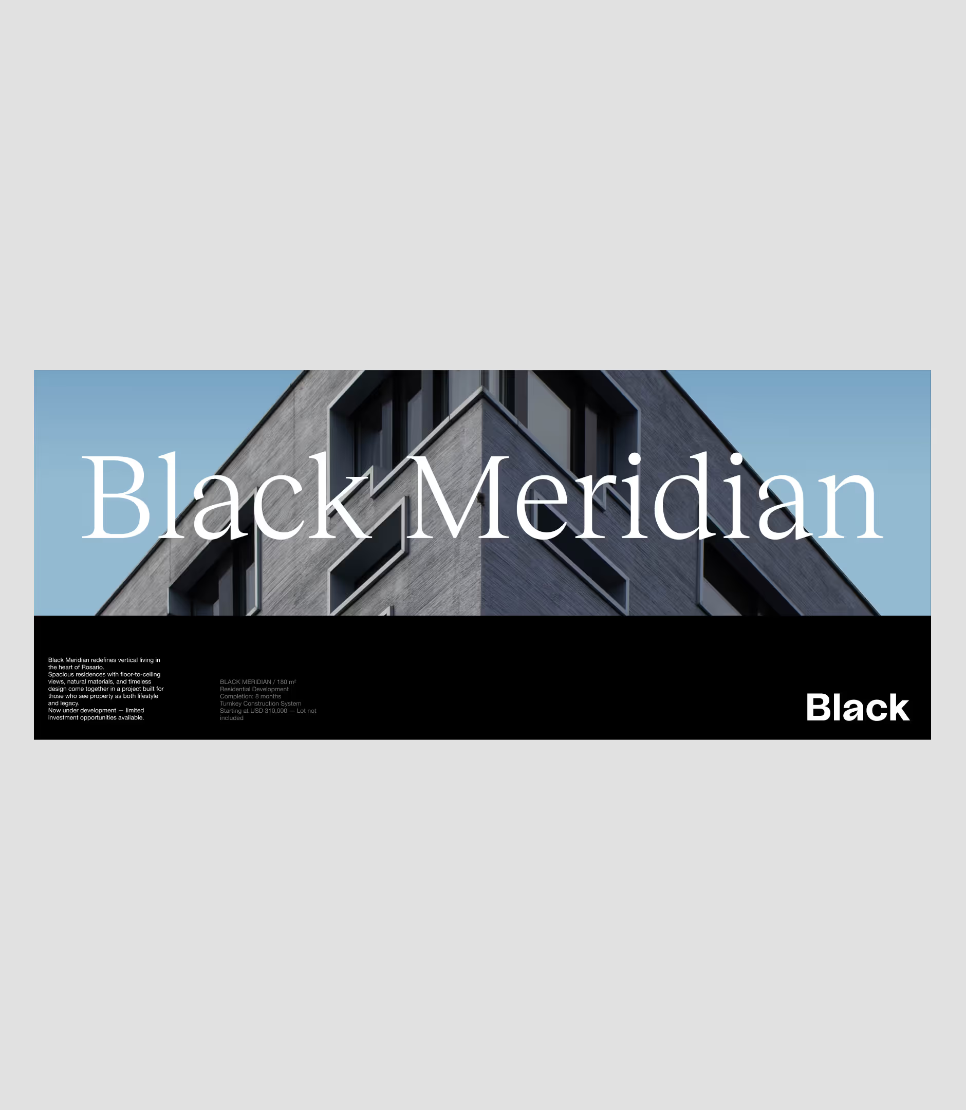
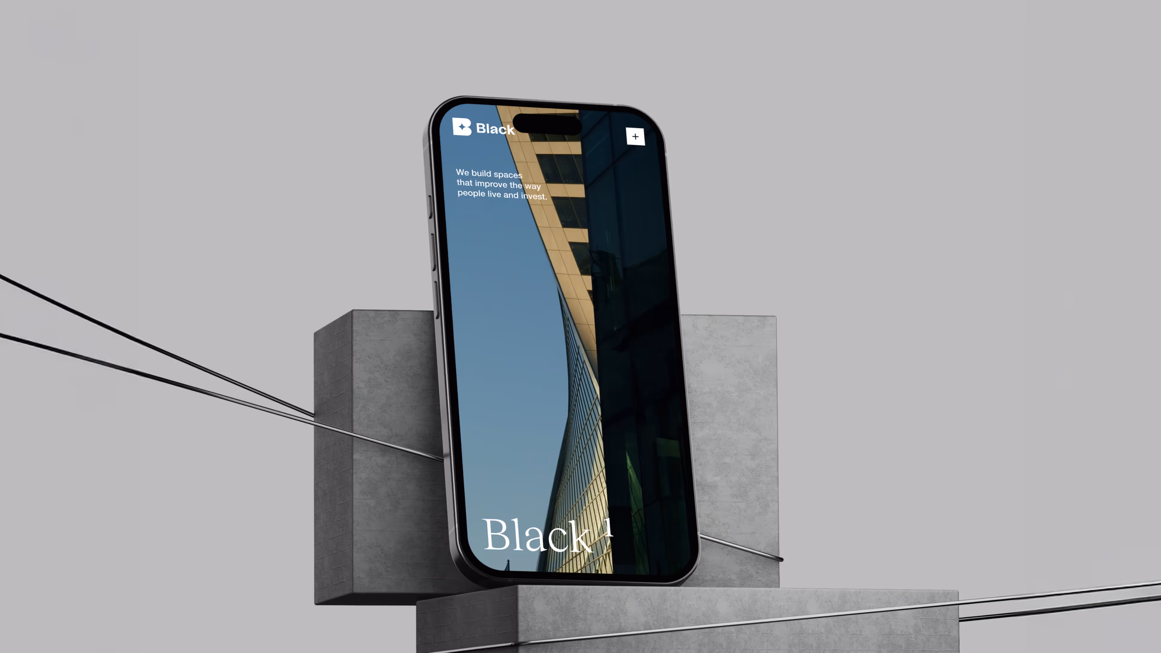
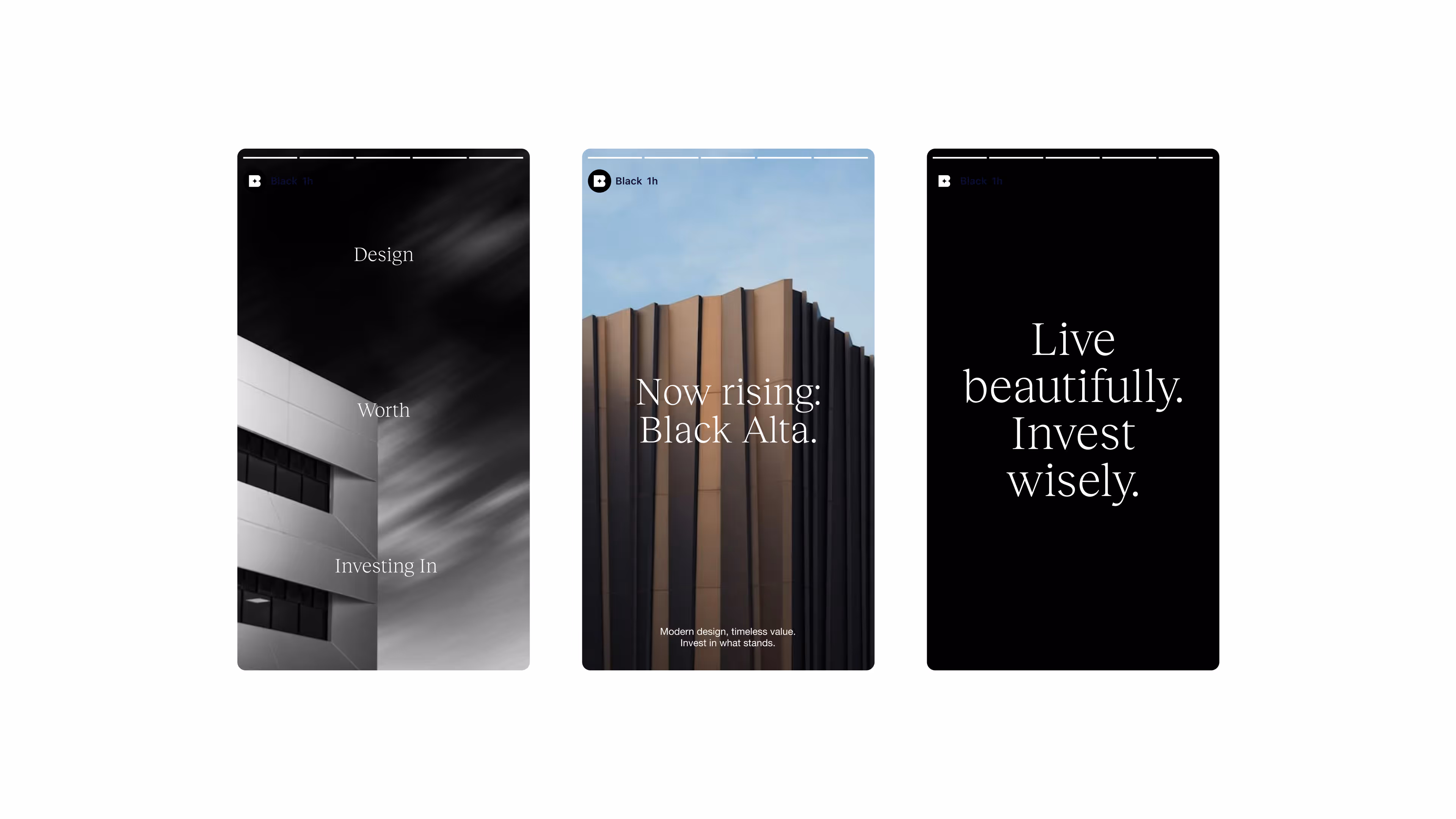
Black is a real-estate development firm where architectural rigor meets investment clarity. The brand is built to signal trust, permanence, and precision.
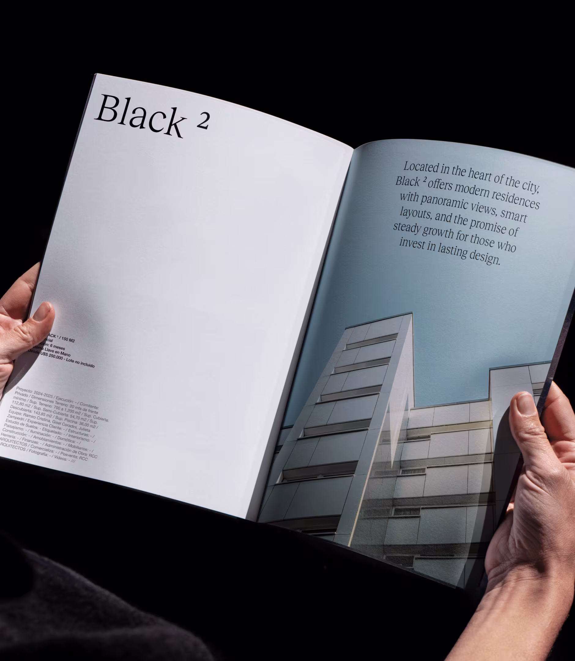
The identity is typography-first: a refined logotype paired with a modern, utilitarian sans creates a clear hierarchy—editorial in tone, operational in use. A strict grid, generous negative space, and disciplined alignment echo architectural plans. Photography is treated like structure: angular crops, high contrast, and material detail emphasize form over flourish.
Across touchpoints—business cards, investor materials, site signage, and web—the system remains minimal and assertive. Gridded diagrams and permit-style notations reference the development process, while restrained color and measured composition keep the focus on design quality and long-term value. The result is an identity that feels architectural, exact, and investment-ready—unmistakably Black.